 Image source: Generated by AI
At the beginning of the new year, after valuations reached a new peak of 0 billion,OpenAI also bid farewell to the old and welcome the new, replaced with new fonts, new logos, and new color schemes, and carried out a comprehensive rebranding exercise.。
The purpose of Open AI’s reshaping this time is to get rid of what design director Shannon Jager said,”OpenAI has been showing itself to the world in a fairly casual way.” The clutter of fonts, logos and colors only highlights the company’s lack of a clear unified strategy.”
The main design changes of large companies often symbolize some changes in the values, development direction and appearance they want to present to the outside world.
OpenAI has grown from a research laboratory established in San Francisco ten years ago to the world’s most valued AI company, and it also needs a new look.
01、What is the beauty of OpenAI’s new design?
This redesign of OpenAI does not change from traditional to modern style like many classic brands, but ratherOn the old design, fine-tuning was made between strokes, and a design language exclusive to OpenAI was also established。
The first big change is the logo of OpenAI。
The intertwined ChatGPT icons we know were born when OpenAI was founded. Because there was no complete visual solution within the company, they were extended from the company Logo to the ChatGPT product.
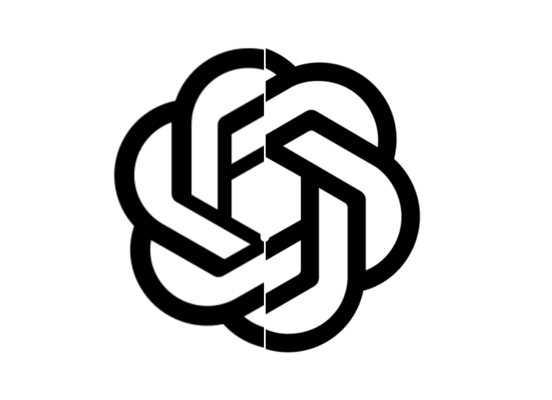
Left: Previous OpenAI Logo Right: New version of OpenAI Logo| Source: OpenAI
OpenAI internally calls this pattern “Blossom” and consists of three triangles intertwined to form a six-sided lasso pattern.
In the new version of the design, the edges of the “flowers” become equal sides, the transition angles become more rounded, the space for interweaving of lines is larger, and the overall appearance is regular and refined.
OpenAI officials have also defined the shape of the six-sided lasso, called it the “Seed of Life”, which wants to convey the concept of organic and humanistic nature.
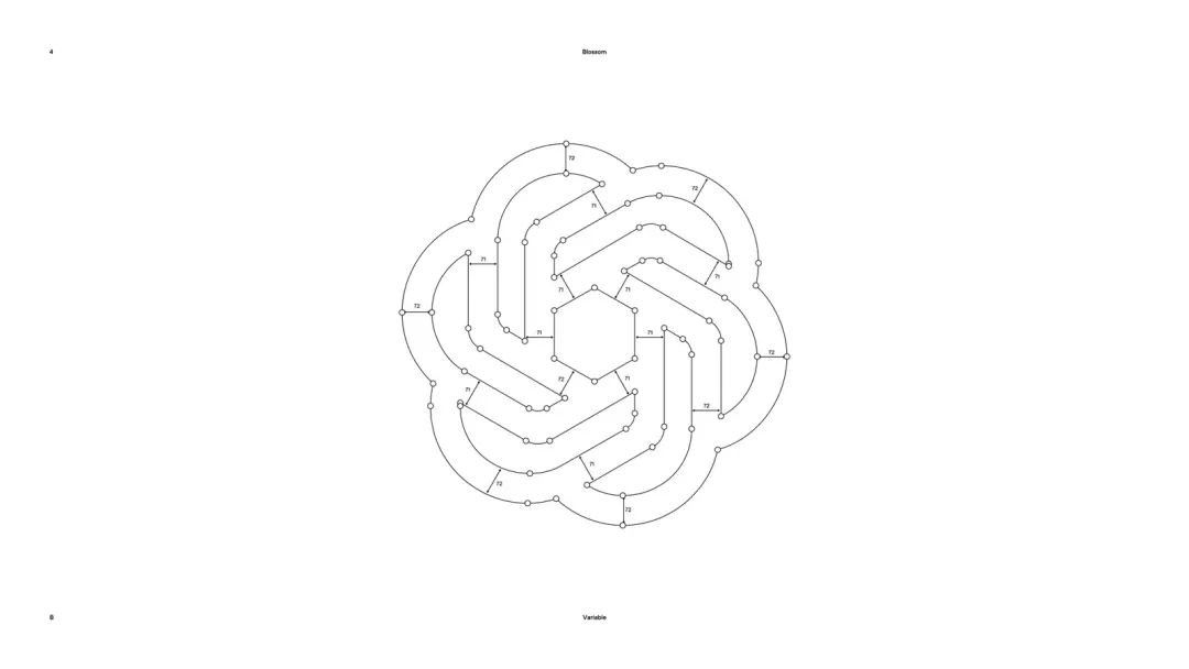
Logo redrawn by OpenAI| Source: OpenAI
The second change is the new font。
As global technology companies increase in popularity, they will consider building a dedicated brand font, which not only saves the high annual font licensing fee, but also serves as a brand identity. Just like Apple developed San Francisco, Google developed Noto Sans, OpenAI also released a new sans serif font this time:
OpenAI Sans。
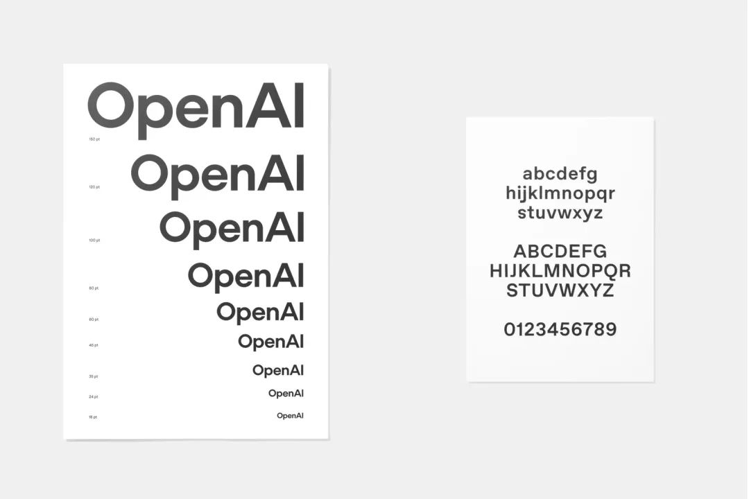
OpenAI Sans| Source: OpenAI
OpenAI’s new text logo is “OpenAI” printed with this font. The entire font adopts a more modern sans serif design. The OpenAI design team claims that OpenAI Sans combines geometric precision, functionality, and approachability brought by roundness. Among them, the most obvious change between the old and new versions is the letter “O”. The O in the new version is like a perfect circle.
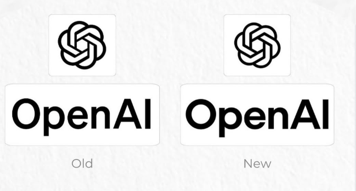
Roundness is the key word in OpenAI’s new design| Photo source: marketingquake
In August last year, OpenAI considered changing a new logo. The proposal at that time was a black perfect “0”, but many employees thought it was too simple, lacking in creativity, and even a little “AI thriller”, so the proposal was shelved.
Today, perfect circles are realized in new typefaces. OpenAI commented as “Font is the most direct refinement of our visual philosophy, and ‘O’ is a perfect circle.」
In fact, OpenAI Sans ‘O just seems perfect. Under the measurement of the drawing software, it can be measured that the O is a perfect circle on the outside, but the inner diameter is not consistent.
This is also the “little egg” left by OpenAI. Their explanation is that “a certain degree of imperfections can offset the precision of the machine and make things feel more humane.”
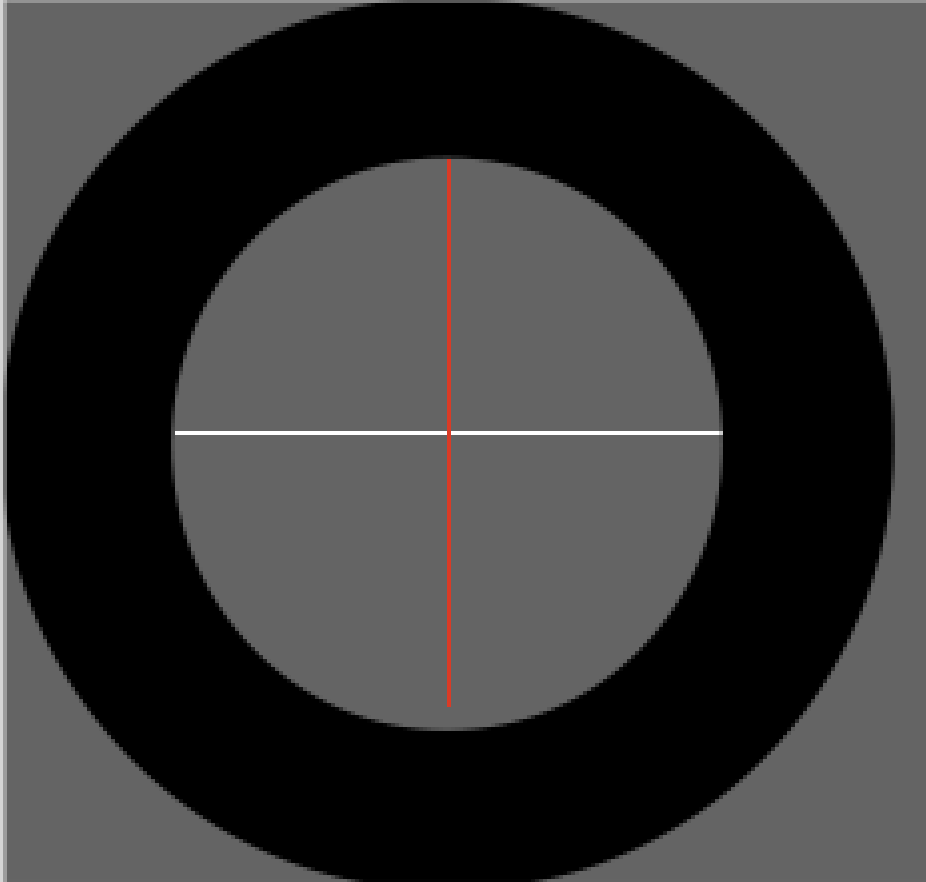
A “perfect” circle is actually an ellipse| Source: The author’s self-cutting
The concepts of circles and dots penetrate into the entire OpenAI Sans design. For example, the letter Q is an extension of O, the “C” and “G” of ChatGPT are deformed based on “O”; the title symbol “?” and “.” The dots are perfect dots.
In the words of Veit Moeller, OpenAI’s head of branding and communication design,”This point has become a bridge across different OpenAI products and departments,” and the new fonts will also appear in OpenAI’s future products, papers, graphics and charts.
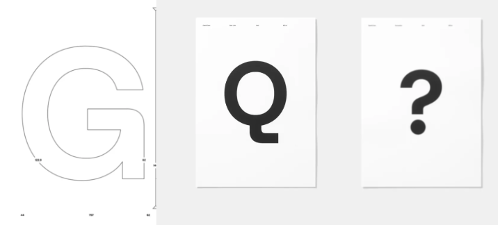
Everything is centered around the circle| Source: The author’s self-cutting
In addition, in terms of color specifications, OpenAI still uses black and white as the main vision, but it will add some color elements. For example, new color matching requirements have been added to data visualization.
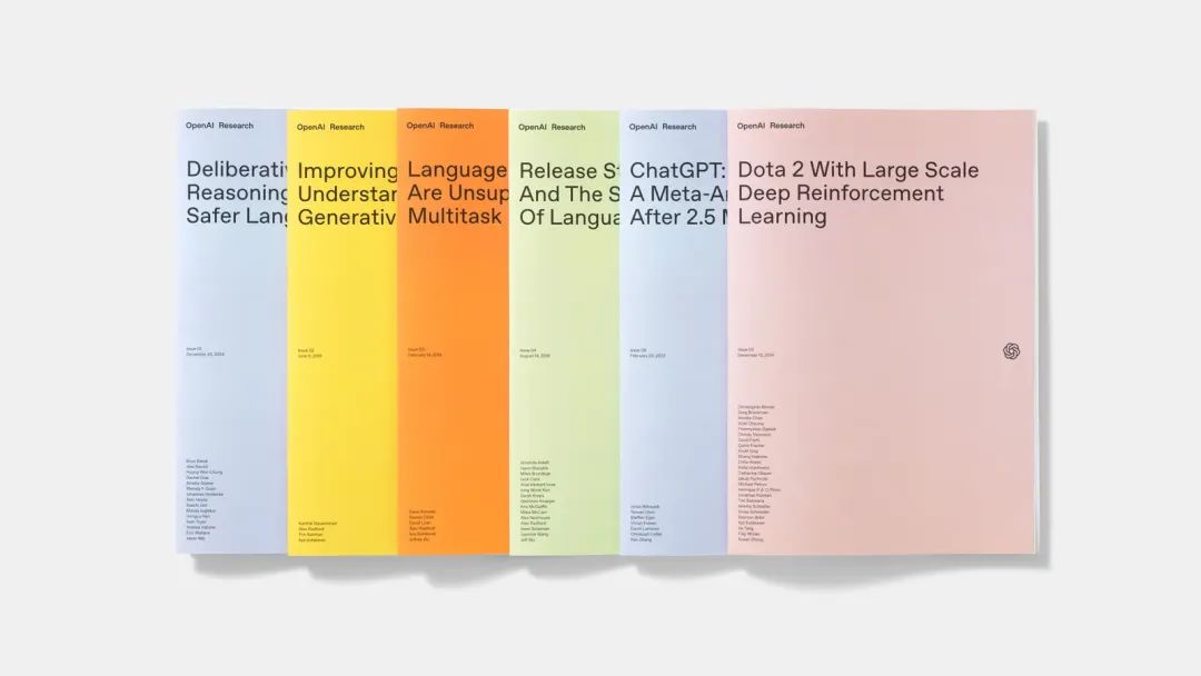
Colorful research reports| Source: OpenAI
The OpenAI design team also launched an “Emotional Point” concept that represents AI interaction。The “emotional point” is a dynamically changing blue and white dot, like clouds in the sky or waves surging on the sea.
Moeller said they wanted to design the logo as a reminder “when humans interact with artificial intelligence”, using a blue color that is quiet and symbolizes nature, and also wanted to make it appear “non-human” and block out recognizable characteristics or emotions.
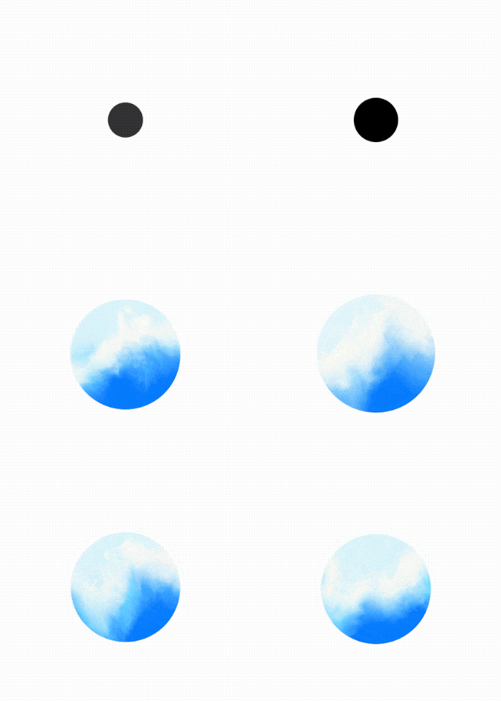
ChatGPT is already in use| Source: Self-made by the author
“Emotional Points” will also be deployed in OpenAI products in various forms. For example, the current “listening” state of ChatGPT is the transition from black dots to “emotional points.”
Not just logos, fonts and colors, but also simpler and clearer typography specifications, multilingual applications, new web images… OpenAI is building a design system that represents its company’s philosophy and values, and the values of this new design are: full of humanity.
02、Design driven by “human” industrial intelligence
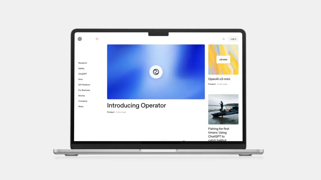
OpenAI official display page| Image source: OpenAI
“Humanization” is the word most often mentioned by design director Moeller in an interview with design magazine Wallpaper. “(The new design) Every interaction, every visual presentation, every detail is designed to make people feel vivid and resonant.” Moeller said
The OpenAI design team wants to create a “more organic” and “more humane” visual identity without losing its sense of authority, can highlight the complexity of its technology, and also reveal the depth of AI exploration.
This has also produced some incomprehensible designs, such as arranging the company’s values in the form of words on a landscape photo, writing the company’s mission statement on the reef far from the waves, and even some words The font size is too small to be seen clearly.
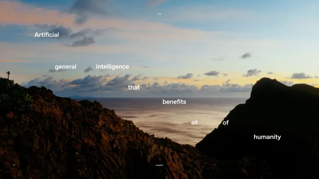
It’s so profound| Source: OpenAI
OpenAI’s explanation is,”We are trying to find a design that is both humane and surprising, with imperfect elements, and try not to create too many rules.”
As for the entire brand restructuring, what proportion does AI account for? Moeller said that AI was only used when calculating word duplication data, except that:
The entire design was personally constructed by designers, photographers, and animators。
This is also the concept OpenAI wants to convey.”We believe that technology should enhance, not replace, the depth of human creativity… Our brand language is based on the nuances of human experience, how to use images to evoke memories, how to make typography reflect the tone, and how to breathe life into ideas.”
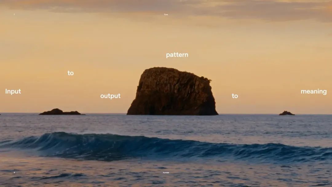
A company that is trying to use artificial intelligence to generate everything has returned to a completely artificial approach to its brand design.
From the seemingly perfect circle to the staggered typography of the company’s mission statement, OpenAI’s new design is like standing at the intersection of human and artificial intelligence. On one end, it is the vividness caused by imperfections, the affinity brought by rounded aesthetics, and on the other. It is the pursuit of equal sides and a perfect circle.
This is what OpenAI has been doing: from people to artificial intelligence.
But when OpenAI truly realized their vision: to create universal artificial intelligence that benefits all mankind. In that world, the unique human creativity, subtle ingenuity, and even the discomfort caused by imperfect design demonstrated by this OpenAI rebranding may be the least noteworthy, or perhaps the most valuable.


